How We Use AI to Speed Up UI/UX Design Phase

Learn how we removed the separate UI/UX phase from a real client build—and put AI prototyping in a business operator’s hands. A practical look at faster handoffs, customer journeys, and the engineering work that still matters.

Sep 9, 2026

How We Use AI to Speed Up UI/UX Design Phase

Sep 9, 2026
5 min

What this article is about

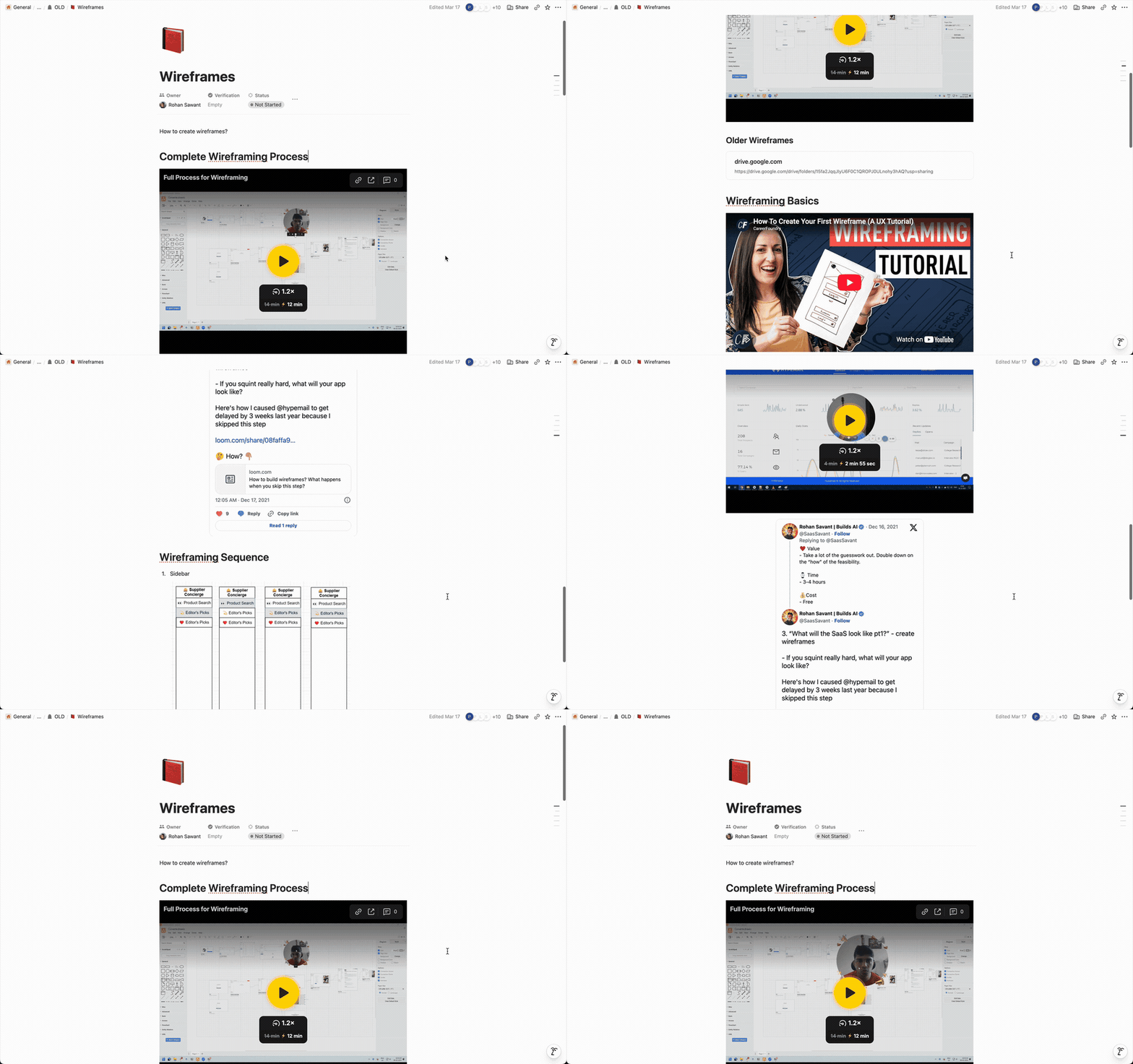
Before Claude, Rohan drew every mockup in every proposal himself. draw.io for the wireframes, Figma for the comps, one to two weeks per proposal. Most of our clients were building a SaaS or a platform for the first time, and the mockup was the step that made the idea real to them.

It was also the work he was proudest of. He believed it was the hardest job in the company. You needed taste, product sense, enough business understanding to know which screen actually mattered, and enough communication to explain to a client why. He taught it publicly.

His thread from October 2022 is that process, step by step: recon the competition, map the workflows, then sketch. It also records what the work cost at the time, which is worth reading now still, for the contrast.

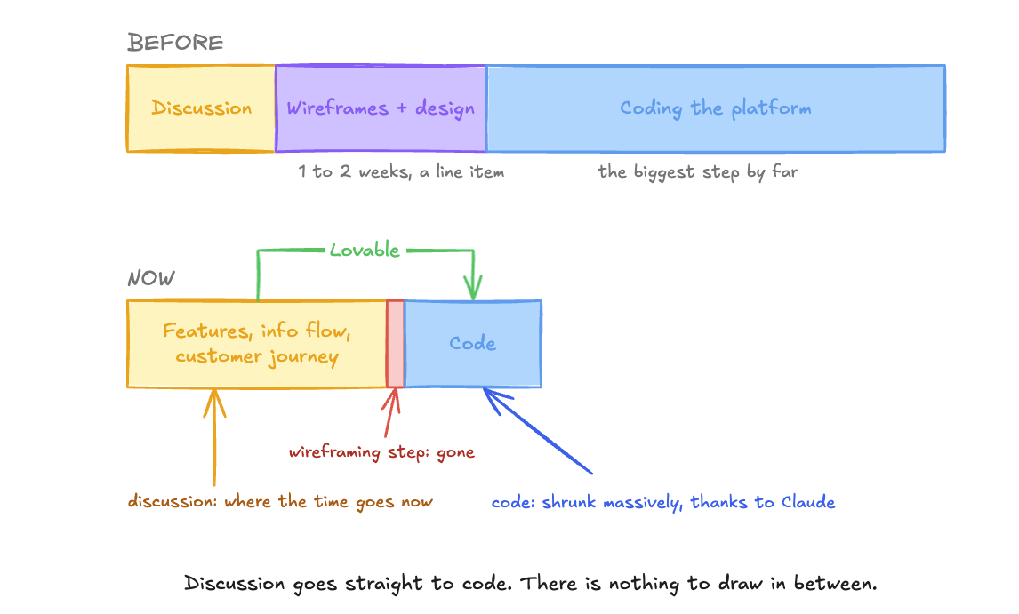
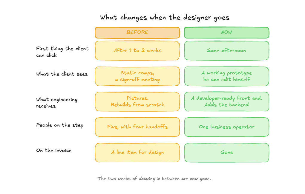
On a full build, the design phase used to run seven to ten days, with a designer on it, and the client paid for it as a separate item.

BUT, on our most recent client build there was no design phase.

The screens came from Mannan, our business operator, working in Claude and Lovable, and the client reviewed the actual screens directly. Rather than some mockup.

We had been shortening this step for two years. This was the first build where it was FULLY absent.

We have been moving in this direction for a while, in proposals first and then in builds, and this was the first engagement where the design phase was removed completely rather than shortened.

What you will learn

By the end of this you will have:

  • The exact call structure that replaced 1–2 weeks of wireframing: six questions, straight from Mannan's feasibility template
  • The five-minute design decision that replaces a designer's comps (it is two colours and one sentence about the audience)
  • Why a demo-grade B2B product is 10–15 Lovable prompts, never one, and what to fix after each
  • The four things Lovable and Claude never catch on their own, and the one pass a human still has to do
  • How to pick features by the numbers a client's business is judged on, before a single screen exists
  • Which work still needs an engineer, and why feasibility is now the heaviest step in the cycle
  • Why a mid-market B2B buyer never notices the designer is gone

How we got here

The mockups began as Rohan's own work: draw.io for the wireframes, Figma for the comps. Most of our clients were building a SaaS or a platform for the first time, and the mockup was what made the idea real to them. It was on the invoice because they would not have signed without it.
Then we grew the way agencies grow: a front-end designer, and a full-stack engineer we taught product design. We used to have “pods” of people working on projects. 2-3 engineers + 1/2 product manager.

When Lovable arrived, we stopped making the mockups by hand and started making full prototypes, functional prototypes almost, and putting those into the proposal. We shared them with clients. Everything in them was fake, fake data on every screen, but the client could click through the product before he had paid a dollar, and his questions got better.

This really enhanced the value of our discovery process.

But when we actually started the project, we still started from scratch. The Lovable design was not good enough. There were rough edges, and the code was horrible.

Then the models got even better, with Fable and Opus, and the gap closed very quickly.
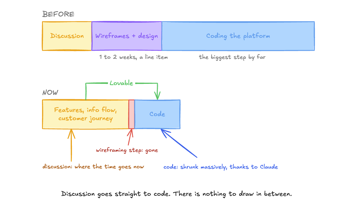
What came out of Lovable was close to what our engineers would have started with anyway, so the step after it, the one with the designer in it, was adding no new information. It was redrawing what the sales team had already agreed with the client. The proposal mockups were as good as the designer's, and some were better.

So we took the design phase out. Entirely. The design language went into one markdown file, the mockup became the first step of engineering, and the person who won the proposal carried it straight into the build.

The sales phase took over the mockup, and the design phase had nothing left to do.

Mockups were needed because code was expensive

In animation, the blockout is a stage where crude grey shapes stand in for the characters, so a bad shot gets caught before the expensive work starts. Wireframes and mockups were the blockout for software. A day or two of wireframes, five to seven days of comps, a front-end mockup, then engineering, because code was costly to write and worse to change.

Code is dirt cheap now. It is basically free. It takes no time to write code thanks to Claude.

The last onboarding flow we built was live the afternoon after the call that specified it. The same flow used to be two weeks of design budget. Budget an afternoon.

The screens now belong to the business operator

A designer does not add much at the mid-market B2B level anymore, because layouts, flows and components come out of the tool at a level the client cannot tell apart from a designer's, and the design language is one markdown file the tool reads.

What is left is taste, and B2B buyers do not pay for taste.

This is a business problem now.

It sits with the people who understand the features, who decide where the features go, how the information flows, and how the customer journey pans out. We were very quickly able to cut the team on this step to one person, and that person was Mannan.

So the whole step now require only two most important people.
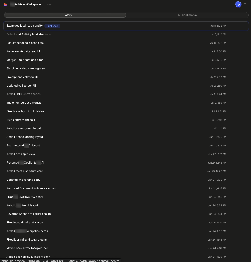
Our business operator, who takes ownership of what the features are and how the information flows, and the client, who wants the features and wants to build the product himself. In larger teams, handoff loses something between brief, wireframe, comp and code.

Two people is one channel, which is why requests come back within a day and the talk stays on what the product does. By the end of a build the client wants to edit the prototype himself. Ours did, because describing a change loses too much on the way.

The step is about understanding and fleshing out the customer journey, not the “UI/UX”

The goal of the UI/UX step is no longer to understand what the product will look like. It is to find out what the specifications are, what the features are, and what the customer journey will be.
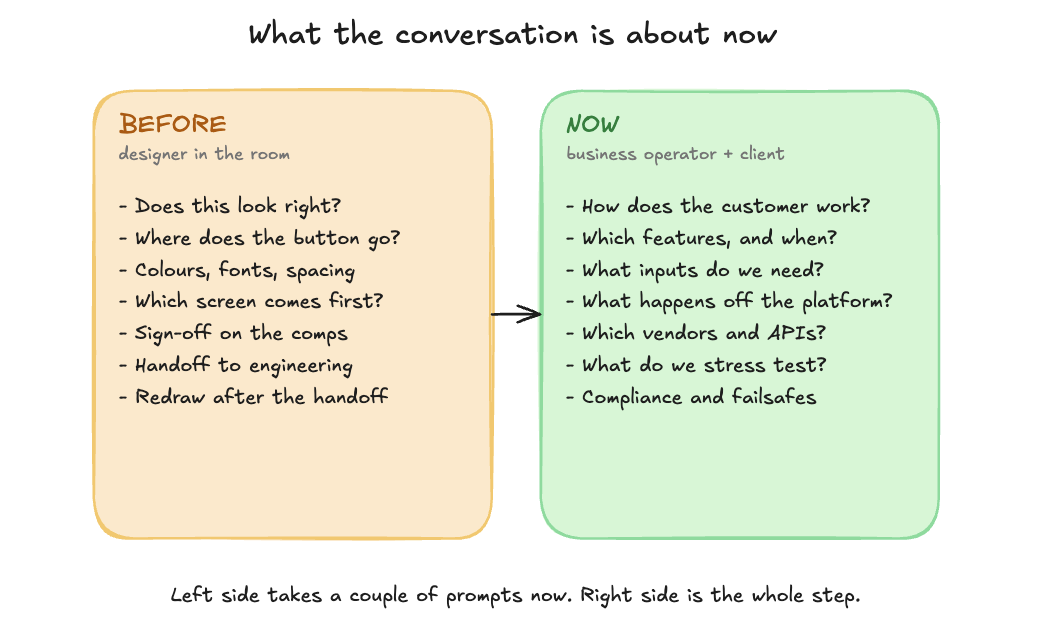
That is where we spent most of our time.

It was never sitting down and changing a button or moving a section. All of that took a couple of prompts, max. What took discussions, what took collaboration with the client, was understanding what they wanted their customer to feel, and how they wanted their customer to go through the product. Seeing what the product looks and feels like is the easy part.

The most important question is how the customers will use it and which features to add. And you’d be surprised how muddy these conversations can get.

So basically, put the product in front of your eyes, understand what the customer will see and go through, and optimise the product for that. A client asks for a workflow builder with triggers and if/else logic inside the UI; we scope it in the UI and a working app exists in days. A client has feedback on a layout; a second live version exists at a second URL by the next morning and we pick one on the call.

This removes tedious review meetings entirely

Reviews have turned into URLs. And we honestly LOVE that!
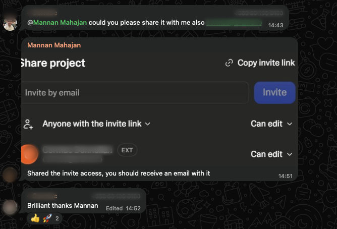
We share the Lovable with the client and he changes it himself, or he sends us a list of prompts he wants run, or a list of changes he wants made, and we throw it into Lovable and it does it.

The work that still has to be done

The business operator does wireframing now instead of a designer, and this is what it consists of.

What to ask on the calls - directly from Mannan

The setup of these calls is a “feasibility report”.

You are finding out what is feasible and what is not before anything gets built, in front of a working prototype instead of a deck. The layout, the colours and the components come out of the tool, so the call is the only place to learn how the customer will work and where the build can fail.

Focus on these:

  • How the customer works. What the customer is trying to get done, which features they meet and in what order, and what inputs you need from them at each step. This is the customer journey, and it takes the most time on every call.
  • What happens outside the platform. The emails, phone calls, spreadsheets and approvals that happen around the product. These decide what the platform has to do, and they are usually where the unclear requirements are.
  • Which vendors and APIs you depend on. Which third party does the core work, what it charges, what its rate limits are, and whether the client's system of record will grant access at all. One line on a pricing page can make the client's economics unworkable before you have built a screen.
  • What you cannot verify until you run it. Whether the model is good enough on a live case, whether the small model will do, whether the integration holds on live data. These are engineering capabilities, and they need a test.
  • What to stress test. If the product depends on an API, make a thousand calls to it before you commit and see how it responds. Find out where it throttles, where it degrades, and how it behaves when it fails.
  • Pitfalls, failsafes, data and compliance. What goes wrong at scale, what the fallback is when it does, how you collect data, what you are not allowed to collect, and what the regulator allows. Decide what is required and what is not before it becomes a line of code.

Every answer goes into the feasibility report, and the report is what the client signs off on. There are no screens to sign off. None of these calls are ever structured around design. The client picks a colour theme, sends over a logo and whatever details he cares about, and that is the entire design conversation.

Build around the numbers the business is judged on

Before any screen exists, Mannan works out which numbers the client's business is judged on.

A dental lab is judged on a handful of metrics, and the people running it think in those metrics all day. So the dashboard gets built to show whether those numbers are going up or down, and features get picked by whether they change them.

A developer has to be told that closure rate or click-through needs optimising.

A business person sees it on the first call. That is the advantage of putting a business operator on this step. The product ends up organised around the client's numbers instead of around whatever the tool generates by default.

How the prototype gets built

Mannan starts in Claude, before Lovable. He gives Claude all the context from the calls and the transcripts and plans the build with it: every feature that could exist and every workflow around it. That becomes an internal PRD.

Then the design decision, which takes five minutes. A primary and a secondary colour from two or three basic pairs: blue and white, green and white, black and white. Then the aesthetic, set by who is going to use it, an older audience or a younger one, technical or not. Claude turns that into the first Lovable prompt, and Lovable returns the basic dashboard layer. Any look-and-feel asks, a bit of glass effect, a transparent sidebar, a button that behaves like a button, go into that first prompt and get fixed before anything else moves.

Lovable does not one-shot anything. A demo-grade product is 10 to 15 prompts, and after every one Mannan looks at what came back and fixes it in the next prompt.

Then the things the tools miss on their own, without fail. Visual errors. Views packed too close together. A button where no one would look for it. A workflow that reads badly. A button that only appears after you scroll, which no user will scroll for. Lovable will not catch these and Claude will not catch these.
A person has to, by intuition, and that intuition is most of the job.

Then the last pass, which is the important one. Copy on every screen, because the next person to touch this is a developer and writing copy is not part of a developer's job. Every detail fixed, because whatever is left unfinished here gets built unfinished.

“Feasibility Analysis” is the heaviest step now

What is left for engineering is the backend, and the things you do not know will work until you run them: what the model suggests on a live case, whether the small model will do, what the vendor charges, whether the integration with the client's system of record is possible, what the regulator allows on outbound calls.

It is API access, vendor pricing, rate limits, regulation, and the backend logic where the business goals get pushed into the software.

Nothing is lost when you remove the designer any way, especially for B2B settings

If you think about what is lost when you remove a designer, the true answer is nothing. As we said above, for a mid-market B2B product there is no loss. B2B buyers do not care as much about amazing design and taste. They care about functionality.

Creative direction is separate. It belongs to your brand and your marketing. Product design is product management, and your PM can do it.

Mannan's title still does not say design btw.

BTW we have a newsletter now, where we publish all this info along with our internal SoPs which don’t surface easily. Sign up if you want access.

Sign up here:

https://bit.ly/4cU0tiL

Create Fast — Impress Instantly

Transform Your Business with AI Solutions

Ready to scale with AI? Get a personalized strategy session with our AI experts. Discover how to automate, optimize, and accelerate your business growth.

BOOK A CALL

Book an AI consultation

Looking to build AI solutions? Let's chat.

Schedule your consultation today - this not a sales call, feel free to come prepared with your technical queries.

You'll be meeting Rohan Sawant, the Founder.
 Company
Book a Call

Let us help you.

Thank you! Your submission has been received!
Oops! Something went wrong while submitting the form.

Behind the Blog

Pranav Patel
Writer

Good boi. He is a good boi & does ML/AI. AI Lead.

Rohan Sawant
Editor

Rohan is the Founder & CEO of Ionio. I make everyone write all these nice articles... 🥵

How We Use AI to Speed Up UI/UX Design Phase

Read Time:
minutes

What this article is about

Before Claude, Rohan drew every mockup in every proposal himself. draw.io for the wireframes, Figma for the comps, one to two weeks per proposal. Most of our clients were building a SaaS or a platform for the first time, and the mockup was the step that made the idea real to them.

It was also the work he was proudest of. He believed it was the hardest job in the company. You needed taste, product sense, enough business understanding to know which screen actually mattered, and enough communication to explain to a client why. He taught it publicly.

His thread from October 2022 is that process, step by step: recon the competition, map the workflows, then sketch. It also records what the work cost at the time, which is worth reading now still, for the contrast.

On a full build, the design phase used to run seven to ten days, with a designer on it, and the client paid for it as a separate item.

BUT, on our most recent client build there was no design phase.

The screens came from Mannan, our business operator, working in Claude and Lovable, and the client reviewed the actual screens directly. Rather than some mockup.

We had been shortening this step for two years. This was the first build where it was FULLY absent.

We have been moving in this direction for a while, in proposals first and then in builds, and this was the first engagement where the design phase was removed completely rather than shortened.

What you will learn

By the end of this you will have:

  • The exact call structure that replaced 1–2 weeks of wireframing: six questions, straight from Mannan's feasibility template
  • The five-minute design decision that replaces a designer's comps (it is two colours and one sentence about the audience)
  • Why a demo-grade B2B product is 10–15 Lovable prompts, never one, and what to fix after each
  • The four things Lovable and Claude never catch on their own, and the one pass a human still has to do
  • How to pick features by the numbers a client's business is judged on, before a single screen exists
  • Which work still needs an engineer, and why feasibility is now the heaviest step in the cycle
  • Why a mid-market B2B buyer never notices the designer is gone

How we got here

The mockups began as Rohan's own work: draw.io for the wireframes, Figma for the comps. Most of our clients were building a SaaS or a platform for the first time, and the mockup was what made the idea real to them. It was on the invoice because they would not have signed without it.

Then we grew the way agencies grow: a front-end designer, and a full-stack engineer we taught product design. We used to have “pods” of people working on projects. 2-3 engineers + 1/2 product manager.

When Lovable arrived, we stopped making the mockups by hand and started making full prototypes, functional prototypes almost, and putting those into the proposal. We shared them with clients. Everything in them was fake, fake data on every screen, but the client could click through the product before he had paid a dollar, and his questions got better.

This really enhanced the value of our discovery process.

But when we actually started the project, we still started from scratch. The Lovable design was not good enough. There were rough edges, and the code was horrible.

Then the models got even better, with Fable and Opus, and the gap closed very quickly.

What came out of Lovable was close to what our engineers would have started with anyway, so the step after it, the one with the designer in it, was adding no new information. It was redrawing what the sales team had already agreed with the client. The proposal mockups were as good as the designer's, and some were better.

So we took the design phase out. Entirely. The design language went into one markdown file, the mockup became the first step of engineering, and the person who won the proposal carried it straight into the build.

The sales phase took over the mockup, and the design phase had nothing left to do.

Mockups were needed because code was expensive

In animation, the blockout is a stage where crude grey shapes stand in for the characters, so a bad shot gets caught before the expensive work starts. Wireframes and mockups were the blockout for software. A day or two of wireframes, five to seven days of comps, a front-end mockup, then engineering, because code was costly to write and worse to change.

Code is dirt cheap now. It is basically free. It takes no time to write code thanks to Claude.

The last onboarding flow we built was live the afternoon after the call that specified it. The same flow used to be two weeks of design budget. Budget an afternoon.

The screens now belong to the business operator

A designer does not add much at the mid-market B2B level anymore, because layouts, flows and components come out of the tool at a level the client cannot tell apart from a designer's, and the design language is one markdown file the tool reads.

What is left is taste, and B2B buyers do not pay for taste.

This is a business problem now.

It sits with the people who understand the features, who decide where the features go, how the information flows, and how the customer journey pans out. We were very quickly able to cut the team on this step to one person, and that person was Mannan.

So the whole step now require only two most important people.

Our business operator, who takes ownership of what the features are and how the information flows, and the client, who wants the features and wants to build the product himself. In larger teams, handoff loses something between brief, wireframe, comp and code.

Two people is one channel, which is why requests come back within a day and the talk stays on what the product does. By the end of a build the client wants to edit the prototype himself. Ours did, because describing a change loses too much on the way.

The step is about understanding and fleshing out the customer journey, not the “UI/UX”

The goal of the UI/UX step is no longer to understand what the product will look like. It is to find out what the specifications are, what the features are, and what the customer journey will be.

That is where we spent most of our time.

It was never sitting down and changing a button or moving a section. All of that took a couple of prompts, max. What took discussions, what took collaboration with the client, was understanding what they wanted their customer to feel, and how they wanted their customer to go through the product. Seeing what the product looks and feels like is the easy part.

The most important question is how the customers will use it and which features to add. And you’d be surprised how muddy these conversations can get.

So basically, put the product in front of your eyes, understand what the customer will see and go through, and optimise the product for that. A client asks for a workflow builder with triggers and if/else logic inside the UI; we scope it in the UI and a working app exists in days. A client has feedback on a layout; a second live version exists at a second URL by the next morning and we pick one on the call.

This removes tedious review meetings entirely

Reviews have turned into URLs. And we honestly LOVE that!

We share the Lovable with the client and he changes it himself, or he sends us a list of prompts he wants run, or a list of changes he wants made, and we throw it into Lovable and it does it.

The work that still has to be done

The business operator does wireframing now instead of a designer, and this is what it consists of.

What to ask on the calls - directly from Mannan

The setup of these calls is a “feasibility report”.

You are finding out what is feasible and what is not before anything gets built, in front of a working prototype instead of a deck. The layout, the colours and the components come out of the tool, so the call is the only place to learn how the customer will work and where the build can fail.

Focus on these:

  • How the customer works. What the customer is trying to get done, which features they meet and in what order, and what inputs you need from them at each step. This is the customer journey, and it takes the most time on every call.
  • What happens outside the platform. The emails, phone calls, spreadsheets and approvals that happen around the product. These decide what the platform has to do, and they are usually where the unclear requirements are.
  • Which vendors and APIs you depend on. Which third party does the core work, what it charges, what its rate limits are, and whether the client's system of record will grant access at all. One line on a pricing page can make the client's economics unworkable before you have built a screen.
  • What you cannot verify until you run it. Whether the model is good enough on a live case, whether the small model will do, whether the integration holds on live data. These are engineering capabilities, and they need a test.
  • What to stress test. If the product depends on an API, make a thousand calls to it before you commit and see how it responds. Find out where it throttles, where it degrades, and how it behaves when it fails.
  • Pitfalls, failsafes, data and compliance. What goes wrong at scale, what the fallback is when it does, how you collect data, what you are not allowed to collect, and what the regulator allows. Decide what is required and what is not before it becomes a line of code.

Every answer goes into the feasibility report, and the report is what the client signs off on. There are no screens to sign off. None of these calls are ever structured around design. The client picks a colour theme, sends over a logo and whatever details he cares about, and that is the entire design conversation.

Build around the numbers the business is judged on

Before any screen exists, Mannan works out which numbers the client's business is judged on.

A dental lab is judged on a handful of metrics, and the people running it think in those metrics all day. So the dashboard gets built to show whether those numbers are going up or down, and features get picked by whether they change them.

A developer has to be told that closure rate or click-through needs optimising.

A business person sees it on the first call. That is the advantage of putting a business operator on this step. The product ends up organised around the client's numbers instead of around whatever the tool generates by default.

How the prototype gets built

Mannan starts in Claude, before Lovable. He gives Claude all the context from the calls and the transcripts and plans the build with it: every feature that could exist and every workflow around it. That becomes an internal PRD.

Then the design decision, which takes five minutes. A primary and a secondary colour from two or three basic pairs: blue and white, green and white, black and white. Then the aesthetic, set by who is going to use it, an older audience or a younger one, technical or not. Claude turns that into the first Lovable prompt, and Lovable returns the basic dashboard layer. Any look-and-feel asks, a bit of glass effect, a transparent sidebar, a button that behaves like a button, go into that first prompt and get fixed before anything else moves.

Lovable does not one-shot anything. A demo-grade product is 10 to 15 prompts, and after every one Mannan looks at what came back and fixes it in the next prompt.

Then the things the tools miss on their own, without fail. Visual errors. Views packed too close together. A button where no one would look for it. A workflow that reads badly. A button that only appears after you scroll, which no user will scroll for. Lovable will not catch these and Claude will not catch these.

A person has to, by intuition, and that intuition is most of the job.

Then the last pass, which is the important one. Copy on every screen, because the next person to touch this is a developer and writing copy is not part of a developer's job. Every detail fixed, because whatever is left unfinished here gets built unfinished.

“Feasibility Analysis” is the heaviest step now

What is left for engineering is the backend, and the things you do not know will work until you run them: what the model suggests on a live case, whether the small model will do, what the vendor charges, whether the integration with the client's system of record is possible, what the regulator allows on outbound calls.

It is API access, vendor pricing, rate limits, regulation, and the backend logic where the business goals get pushed into the software.

Nothing is lost when you remove the designer any way, especially for B2B settings

If you think about what is lost when you remove a designer, the true answer is nothing. As we said above, for a mid-market B2B product there is no loss. B2B buyers do not care as much about amazing design and taste. They care about functionality.

Creative direction is separate. It belongs to your brand and your marketing. Product design is product management, and your PM can do it.

Mannan's title still does not say design btw.

BTW we have a newsletter now, where we publish all this info along with our internal SoPs which don’t surface easily. Sign up if you want access.

Sign up here:

https://bit.ly/4cU0tiL